Monochrome Mirage: Decorating with Your Colorblind Spot
Understanding Colorblindness and Design
Colorblindness, or color vision deficiency, affects a significant portion of the population. While complete achromatopsia (seeing only in shades of gray) is rare, various forms of colorblindness impact how individuals perceive color. This can present unique challenges when it comes to decorating a home. However, it also opens up exciting opportunities to explore design principles in a fresh and innovative way. The key is to focus on elements that transcend color, such as texture, light, and form. By understanding the specific type of colorblindness and its impact on visual perception, decorators can create spaces that are not only aesthetically pleasing but also accessible and comfortable for everyone.
Many people with colorblindness struggle to distinguish between reds and greens, or blues and yellows. This doesn't mean they can't appreciate a beautiful home; it simply means that color choices need to be approached with more consideration. Using tools like color contrast checkers can be incredibly helpful. These tools analyze the contrast between different colors and provide feedback on whether they are easily distinguishable for people with various types of colorblindness. This awareness allows you to make informed decisions about paint colors, furniture fabrics, and accent pieces.
Ultimately, decorating with colorblindness in mind is about creating a space that is both visually appealing and functional for all occupants. It's about embracing simplicity, focusing on texture and light, and using color strategically to enhance the overall design. Whether you are colorblind yourself or designing for someone who is, understanding the nuances of color vision deficiency is crucial for creating a home that is truly welcoming and inclusive.
The Allure of Monochrome: A Safe and Stylish Choice
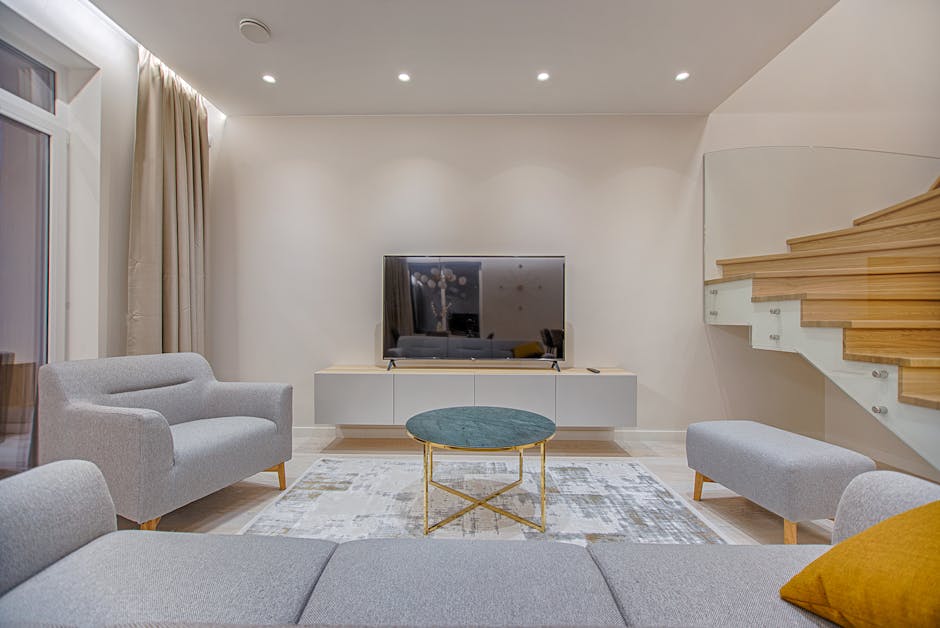
Monochrome design, using variations of a single color, offers a fantastic solution for those navigating colorblindness. It simplifies the visual landscape, allowing you to focus on the interplay of light and shadow, and the nuances of texture. Think beyond just black and white! A monochrome scheme can be built around any color family – from soothing blues to warm grays, or even earthy browns. The key is to use different tints, shades, and tones of that single color to create depth and visual interest.
The beauty of monochrome lies in its versatility. It can be adapted to suit any style, from minimalist and modern to classic and traditional. In a monochrome space, the texture becomes paramount. Consider incorporating a mix of materials like smooth silk, rough linen, and textured wood to add tactile interest and prevent the space from feeling flat. Varying the sheen levels of different surfaces can also create subtle contrasts and visual depth. For instance, a matte wall paired with a glossy trim can add a touch of sophistication.
Furthermore, monochrome schemes are inherently calming and sophisticated. They create a sense of visual harmony and can be particularly effective in bedrooms or living rooms, where relaxation is key. By eliminating the distraction of clashing colors, you can create a space that feels serene and inviting. Popular tools like Adobe Color (https://color.adobe.com/) can help you generate harmonious color palettes, even within a monochrome framework.

Beyond Color: Texture, Light, and Form
When color perception is limited, the importance of other design elements skyrockets. Texture becomes a critical tool for adding visual interest and depth to a room. Think about incorporating a variety of textures through fabrics, furniture, and accessories. A chunky knit throw blanket, a smooth leather chair, and a rough-hewn wooden table can all contribute to a rich and engaging sensory experience. Don't be afraid to layer textures to create even more complexity.
Light plays an equally important role. Natural light can dramatically impact the appearance of a space, highlighting textures and creating shadows. Maximize natural light by using sheer window coverings and placing mirrors strategically to reflect light throughout the room. Artificial lighting should also be carefully considered. Use a combination of ambient, task, and accent lighting to create a layered and dynamic effect. Dimmable lights can be particularly useful, allowing you to adjust the intensity of the light to suit different moods and activities.
Form, or the overall shape and structure of objects, is another essential element. Choose furniture and accessories with interesting shapes and silhouettes. A sculptural lamp, a curved sofa, or a collection of geometric vases can all add visual interest to a space. Consider the negative space around objects as well. Empty space can be just as important as filled space in creating a balanced and harmonious design. Services like Houzz (https://www.houzz.com/) can provide inspiration for incorporating different textures, lighting schemes, and furniture forms into your home.

Strategic Use of Accent Colors (If Desired)
While monochrome schemes offer a safe and stylish solution, some individuals with colorblindness may still want to incorporate accent colors. The key is to choose these colors carefully and use them strategically. Opt for colors that are easily distinguishable from the dominant color in the room. For example, if you have a gray monochrome scheme, consider adding pops of yellow or blue, as these colors are often easier to differentiate. Color contrast tools can be invaluable in determining which colors will work best.
When using accent colors, less is often more. A few carefully chosen accessories, such as throw pillows, artwork, or a vase of flowers, can add just the right amount of visual interest without overwhelming the space. Avoid using accent colors on large surfaces, such as walls or floors, as this can create a jarring effect. Instead, focus on using them in smaller, more contained areas. Consider the placement of accent colors as well. Placing them near areas with good lighting can help to make them more visible and impactful.
It's also important to consider the emotional impact of different colors. Some colors are associated with certain moods or feelings. For example, blue is often associated with calmness and serenity, while yellow is associated with energy and optimism. Choose accent colors that align with the overall mood and atmosphere you want to create in your home. You can even consult with a professional interior designer who specializes in accessible design to get personalized advice and guidance. Apps like Coolors (https://coolors.co/) can help you generate accessible color palettes.

Tools and Resources for Accessible Design
Designing for colorblindness doesn't have to be a daunting task. There are numerous tools and resources available to help you create a beautiful and accessible home. Color contrast checkers, like the ones offered by WebAIM (https://webaim.org/resources/contrastchecker/), are essential for ensuring that colors are easily distinguishable. These tools allow you to input different color combinations and receive feedback on their contrast ratio. They can also suggest alternative color combinations that meet accessibility guidelines.
Online color palette generators, such as Adobe Color and Coolors, can help you create harmonious color schemes that are also accessible. These tools allow you to specify your desired color palette and then generate variations that are optimized for colorblindness. They can also suggest complementary colors that will work well together. In addition to online tools, there are also a number of books and articles that provide guidance on designing for colorblindness. These resources can offer valuable insights into the challenges faced by individuals with color vision deficiency and provide practical tips for creating inclusive designs.
Finally, don't be afraid to seek professional help. An interior designer who specializes in accessible design can provide personalized advice and guidance based on your specific needs and preferences. They can help you choose colors, textures, and lighting schemes that will create a comfortable and visually appealing home for everyone. Consider consulting with organizations like the American Society of Interior Designers (ASID) to find qualified professionals in your area. Remember, creating a home that is accessible to everyone is not only the right thing to do, but it can also lead to a more beautiful and functional space for all.

So, embrace your unique perspective and create a space that's authentically, beautifully you!
-YourDad


Comments
Post a Comment