Ugly Palette Power: Unlocking Decorating Genius with Color Clashes
Embrace the Unexpected: Why 'Ugly' Palettes Work
We've all been there: staring at a set of colors that, on the surface, seem utterly incompatible. Colors that clash, colors that vibrate, colors that make you instinctively recoil. But what if I told you that these so-called 'ugly' palettes hold a secret power? The power to create truly unique, dynamic, and unforgettable spaces. The key is understanding *why* they work, and *how* to wield them effectively.
The truth is, beauty is subjective, and what one person considers an eyesore, another might find captivating. Think about it: nature itself is full of seemingly discordant color combinations that somehow harmonize beautifully. From the vibrant clash of a peacock's feathers to the unexpected pairing of a fiery sunset against a deep blue ocean, nature proves that 'ugly' colors can create breathtaking effects. In interior design, embracing these unexpected pairings can lead to spaces that are full of personality, energy, and visual interest.
Furthermore, using unexpected color combinations can be a powerful way to express your individuality and break free from design norms. In a world saturated with beige and gray, daring to use colors that challenge the status quo can make your space stand out and reflect your unique style. It's about taking risks, experimenting, and ultimately, creating a space that you love, regardless of what anyone else thinks.
Understanding Color Theory (And When to Break It)
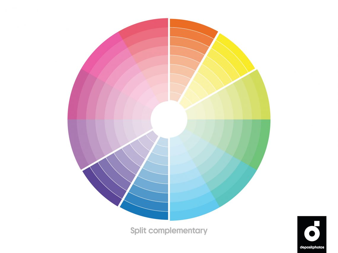
Before you dive headfirst into the world of clashing colors, it's helpful to have a basic understanding of color theory. Knowing the relationships between colors – complementary, analogous, triadic, etc. – will give you a solid foundation for making informed decisions, even when you're deliberately breaking the rules. For example, understanding that complementary colors (those opposite each other on the color wheel) create high contrast can help you predict how they will interact in a space.
However, the most important thing to remember is that color theory is a guideline, not a rigid set of laws. The best designs often come from pushing boundaries and challenging conventional wisdom. Don't be afraid to experiment with unexpected combinations and see what happens. Consider the following basic concepts:
- Hue: The pure color (red, blue, green, etc.)
- Saturation: The intensity or purity of the color.
- Value: How light or dark the color is.
Manipulating these three elements is key to creating successful color clashes. For instance, pairing a highly saturated color with a muted one can create a dynamic contrast without being overwhelming. Similarly, using colors with similar values can create a more harmonious effect, even if the hues are drastically different.
Techniques for Harmonizing Clashing Colors
So, you've got your 'ugly' palette, and you're ready to unleash its potential. But how do you actually make it work? Here are some techniques for harmonizing clashing colors and creating a cohesive design:
- Use a Neutral Base: Ground your bold colors with a neutral backdrop. White, gray, beige, or even a muted black can provide a calming foundation that allows the clashing colors to pop without overwhelming the space.
- Vary the Saturation: As mentioned earlier, playing with saturation is crucial. If you're using two highly saturated colors, try muting one of them to create a more balanced effect.
- Introduce Texture: Texture can be a powerful tool for softening the impact of clashing colors. Think about incorporating natural materials like wood, stone, or textiles to add depth and visual interest.
- Repeat Colors Strategically: Repeating colors throughout the space, even in small doses, can help to tie the design together and create a sense of cohesion.
- Embrace Imperfection: Don't strive for perfect harmony. The beauty of clashing colors lies in their imperfection. Embrace the unexpected juxtapositions and allow the space to have its own unique character.
Tools like the Adobe Color website can be helpful for exploring color combinations and creating custom palettes. Experiment with different settings to see how varying saturation and value can impact the overall effect. You can also use apps like Canva to upload photos of your space and experiment with different color schemes virtually before committing to any actual painting or decorating.
Examples of Successfully 'Ugly' Palettes
To inspire your own color clashing adventures, let's look at some examples of 'ugly' palettes that have been successfully used in interior design:
| Palette | Description |
|---|---|
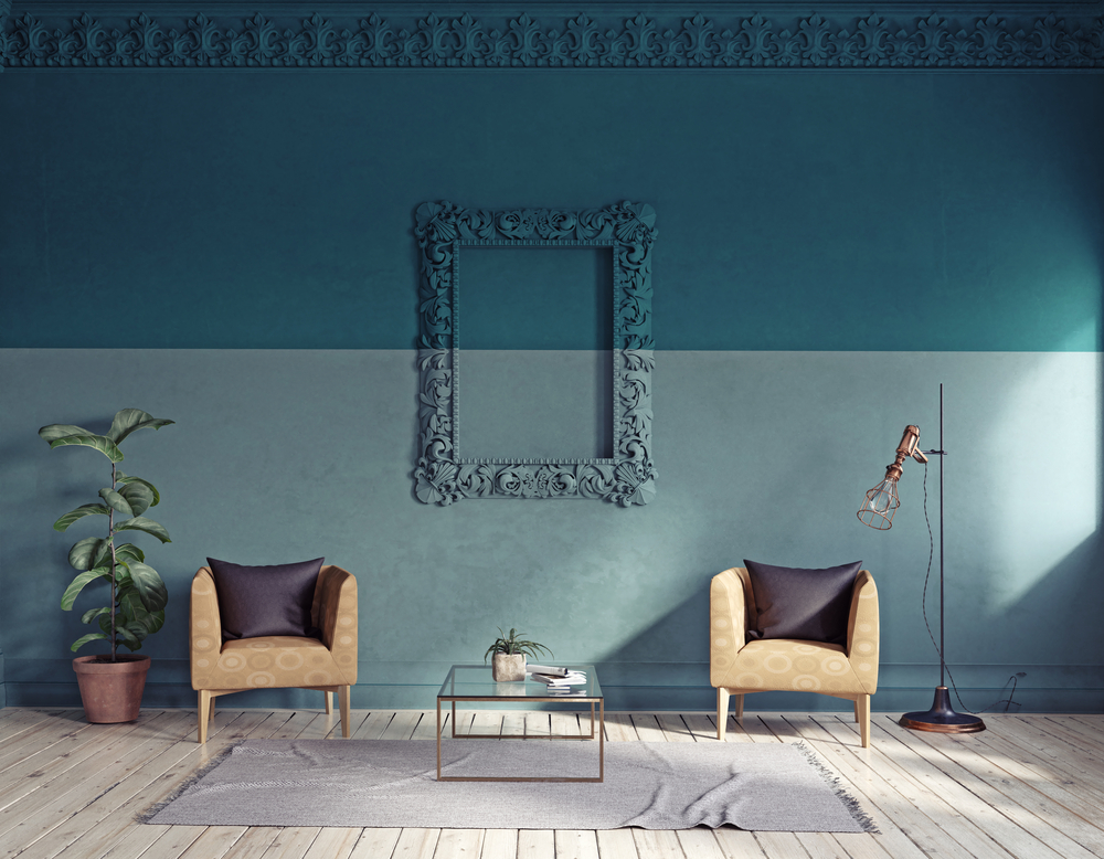
| Mustard Yellow & Teal | A surprisingly sophisticated combination that works well in both modern and traditional settings. The warmth of the mustard yellow is balanced by the coolness of the teal, creating a dynamic and inviting space. |
| Pink & Green | Often considered a childish combination, pink and green can be incredibly chic when done right. Opt for muted shades of pink and green, and incorporate plenty of texture to create a luxurious and inviting space. |
| Orange & Purple | A bold and energetic combination that's perfect for creating a statement. Use orange and purple sparingly, and balance them with plenty of white or other neutral colors. |
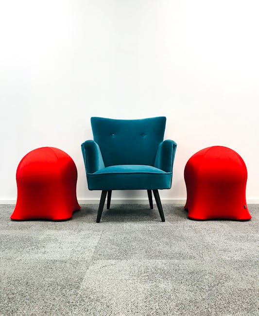
| Red & Blue | A classic combination that can feel jarring if not handled carefully. Opt for shades of red and blue that are slightly muted, and incorporate plenty of white space to create a balanced and harmonious space. |
These are just a few examples, of course. The possibilities are endless! The key is to experiment and find combinations that you love, regardless of what anyone else thinks.

Your Turn: Unleash Your Inner Color Maverick
Now that you're armed with the knowledge and inspiration, it's time to unleash your inner color maverick! Don't be afraid to experiment with 'ugly' palettes and create spaces that are truly unique and expressive. Start small by incorporating clashing colors in accessories, artwork, or accent walls. As you become more comfortable, you can gradually introduce them into larger elements of the design.
Remember, the most important thing is to have fun and create a space that you love. So, go ahead, embrace the unexpected, and discover the power of 'ugly' palettes!
And don't forget to share your creations online! Platforms like Instagram and Pinterest are great places to find inspiration and connect with other design enthusiasts. Use hashtags like #colorclash, #uglypalette, and #interiordesign to showcase your work and inspire others.
So go on, embrace the unexpected and let your personality shine through your gloriously clashing, utterly *you* home!
-YourDad


Comments
Post a Comment