Ugly-Duckling Decor: Transform Your Home with Colors You Loathe (and Love the Results!)
Embrace the Unexpected: Decorating with Unloved Colors
We all have them: colors that make us cringe. Maybe it's avocado green, reminiscent of outdated kitchens, or a jarring shade of mustard yellow that clashes with everything in your closet. But what if those very colors held the key to unlocking a unique and stunning interior design? The secret lies in understanding color theory, balance, and how to use these 'ugly duckling' shades as unexpected accents to create a space that's both personal and surprisingly chic.
This isn't about forcing yourself to live with colors you genuinely hate. It's about challenging your perceptions and exploring the potential of colors you might have dismissed out of hand. You might be surprised at how a touch of that dreaded orange, when paired with the right complementary hues and textures, can bring warmth and vibrancy to a room.
Ready to embark on this unconventional decorating adventure? Let's dive in!

Understanding Your Color Biases
Before we start slinging paint, it's crucial to understand why you dislike certain colors. Is it a personal association with a negative experience? Does the color clash with your existing furniture or style? Or is it simply a matter of societal trends influencing your perception? Identifying the root cause of your aversion will help you approach these colors with a more open mind.
Consider these factors:
- Personal Associations: Colors can trigger powerful memories and emotions. A particular shade might remind you of a childhood bedroom you disliked or an unpleasant event.
- Style Compatibility: Some colors simply don't mesh well with certain design aesthetics. A neon pink might feel out of place in a minimalist Scandinavian-style home.
- Trend Influence: Interior design trends are constantly evolving. Colors that were once considered fashionable can quickly fall out of favor, leading to a negative association.
Once you've pinpointed the reasons behind your color biases, you can begin to challenge those perceptions and explore the potential of these 'unloved' hues in a new light.

The Art of Color Harmony: Making the Unworkable, Work
The key to successfully incorporating colors you dislike is understanding the principles of color harmony. This involves using the color wheel to identify complementary, analogous, and triadic color schemes that can balance and enhance even the most challenging shades.
Here's a quick refresher on color theory:
| Color Scheme | Description |
|---|---|
| Complementary | Colors that are opposite each other on the color wheel (e.g., blue and orange). They create a high-contrast, vibrant look. |
| Analogous | Colors that are next to each other on the color wheel (e.g., blue, blue-green, and green). They create a harmonious, calming feel. |
| Triadic | Three colors that are equally spaced on the color wheel (e.g., red, yellow, and blue). They create a balanced and playful effect. |
Consider using online color palette generators like Coolors or the Adobe Color Wheel to experiment with different combinations and find unexpected pairings that work. Don't be afraid to play around and see what sparks your interest. You might discover that a touch of that 'ugly' brown, when paired with soft blues and creams, creates a surprisingly sophisticated and inviting atmosphere.

Small Doses, Big Impact: Accent Colors and Strategic Placement
You don't have to paint an entire room in a color you dislike to make it work. In fact, the most effective way to incorporate these shades is to use them as accent colors. Think throw pillows, artwork, vases, or even a single statement chair. By using small doses of the 'ugly duckling' color, you can add a touch of unexpected interest without overwhelming the space.
Consider these strategies for strategic placement:
- Focal Points: Use the color to draw attention to a specific area of the room, such as a fireplace or a gallery wall.
- Layering: Introduce the color in multiple layers, such as a rug, curtains, and throw pillows, to create a cohesive and balanced look.
- Balance: Pair the color with neutral tones and natural materials to prevent it from feeling too overwhelming.
Remember, less is often more. A carefully chosen accent color can add a touch of personality and intrigue without dominating the space.

Texture and Tone: Softening the Blow
The texture and tone of a color can significantly impact how it's perceived. A glossy, bright orange might feel overwhelming, while a matte, muted terracotta can be surprisingly warm and inviting. Experiment with different textures and tones to find a version of the 'ugly duckling' color that you can actually live with.
Consider these options:
- Matte vs. Glossy: Matte finishes tend to be more subtle and understated, while glossy finishes are more reflective and attention-grabbing.
- Light vs. Dark: Lighter shades of a color will feel more airy and spacious, while darker shades will feel more dramatic and intimate.
- Texture: Incorporating texture, such as velvet, linen, or wool, can add depth and dimension to a color, making it feel more complex and interesting.
For example, if you dislike a bright, primary yellow, try using a muted, textured mustard yellow in a throw blanket or a piece of artwork. The softer tone and added texture will make the color feel less jarring and more inviting.

From Loathing to Loving: Finding Beauty in the Unexpected
Decorating with colors you dislike is a challenge, but it's also an opportunity to push your creative boundaries and create a truly unique and personal space. By understanding your color biases, embracing the principles of color harmony, and experimenting with different textures and tones, you can transform those 'ugly duckling' shades into unexpected accents that add character and charm to your home.
Don't be afraid to step outside of your comfort zone and try something new. You might be surprised at how much you love the results!
Remember, the most important thing is to create a space that reflects your personality and makes you feel happy and comfortable. So, go ahead, embrace the unexpected and discover the beauty in those colors you once loathed. You might just find your new favorite hue!
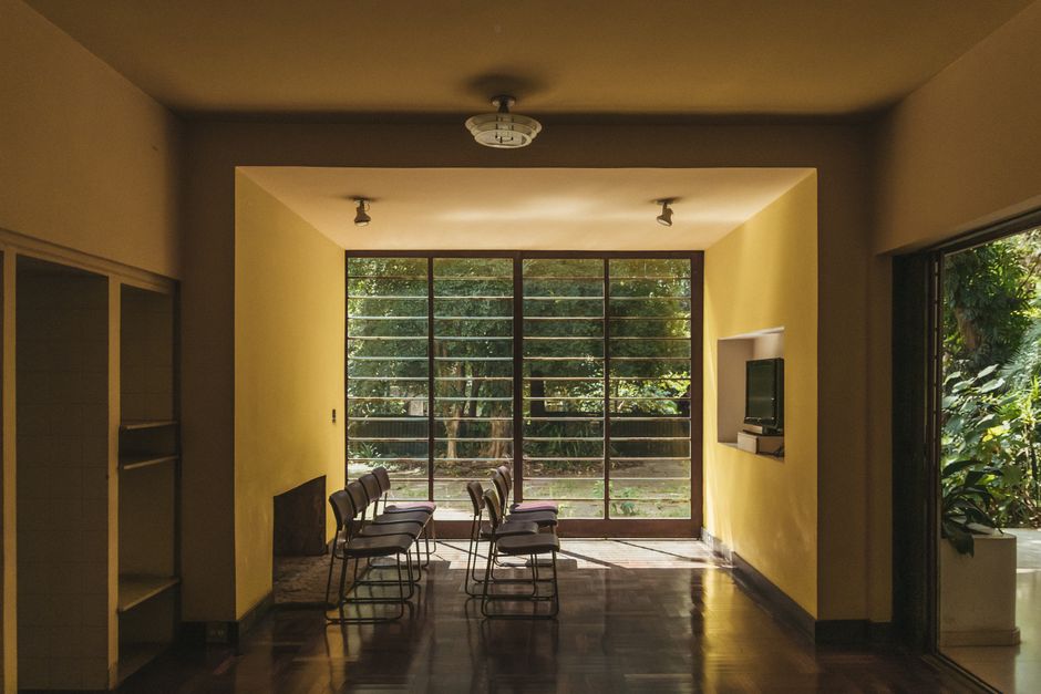
So, go on, embrace the unexpected and watch your home blossom into a uniquely beautiful reflection of *you*!
-YourDad


Comments
Post a Comment